Let's connect!
Billding web & app MVP
Client
Billding
Year
2023
Areas
Web & Mobile app design, Design system
Background & Result
Billding, an Italian startup, offers an all-in-one platform that simplifies and clarifies household utility management for consumers.
In 2023, I led the UX and UI design for Billding’s MVP mobile and web app, taking full responsibility for crafting a seamless cross-platform experience. I established a unified design system from scratch and collaborated proactively with operations and development teams to refine user flows and interface consistency across devices.
By the end of 2023, the app successfully launched and achieved a 4.8/5 rating on Trustpilot, reflecting strong user satisfaction. Despite a strategic pivot and new product iteration, the solid application framework and design system I built laid a strong foundation for the product’s continued evolution.
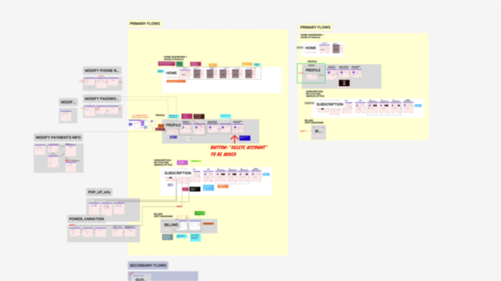
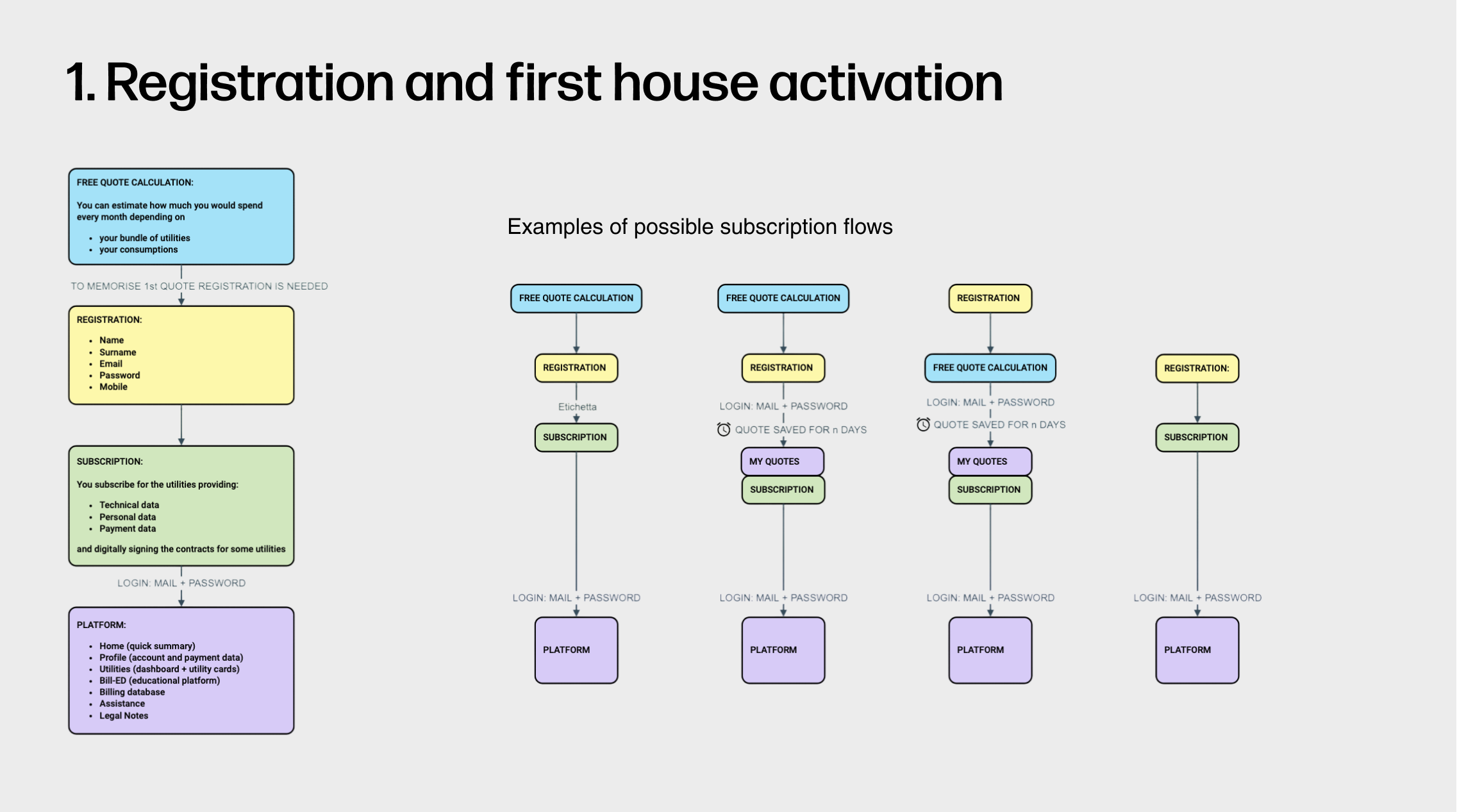
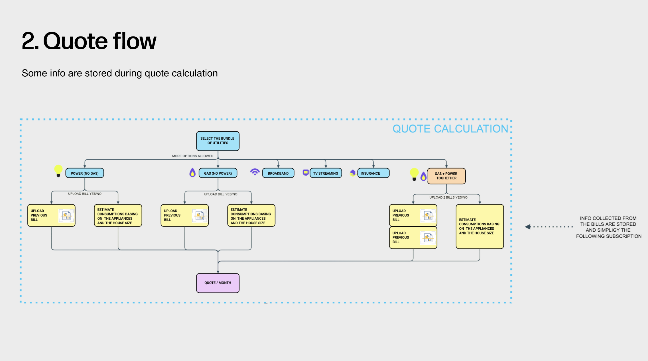
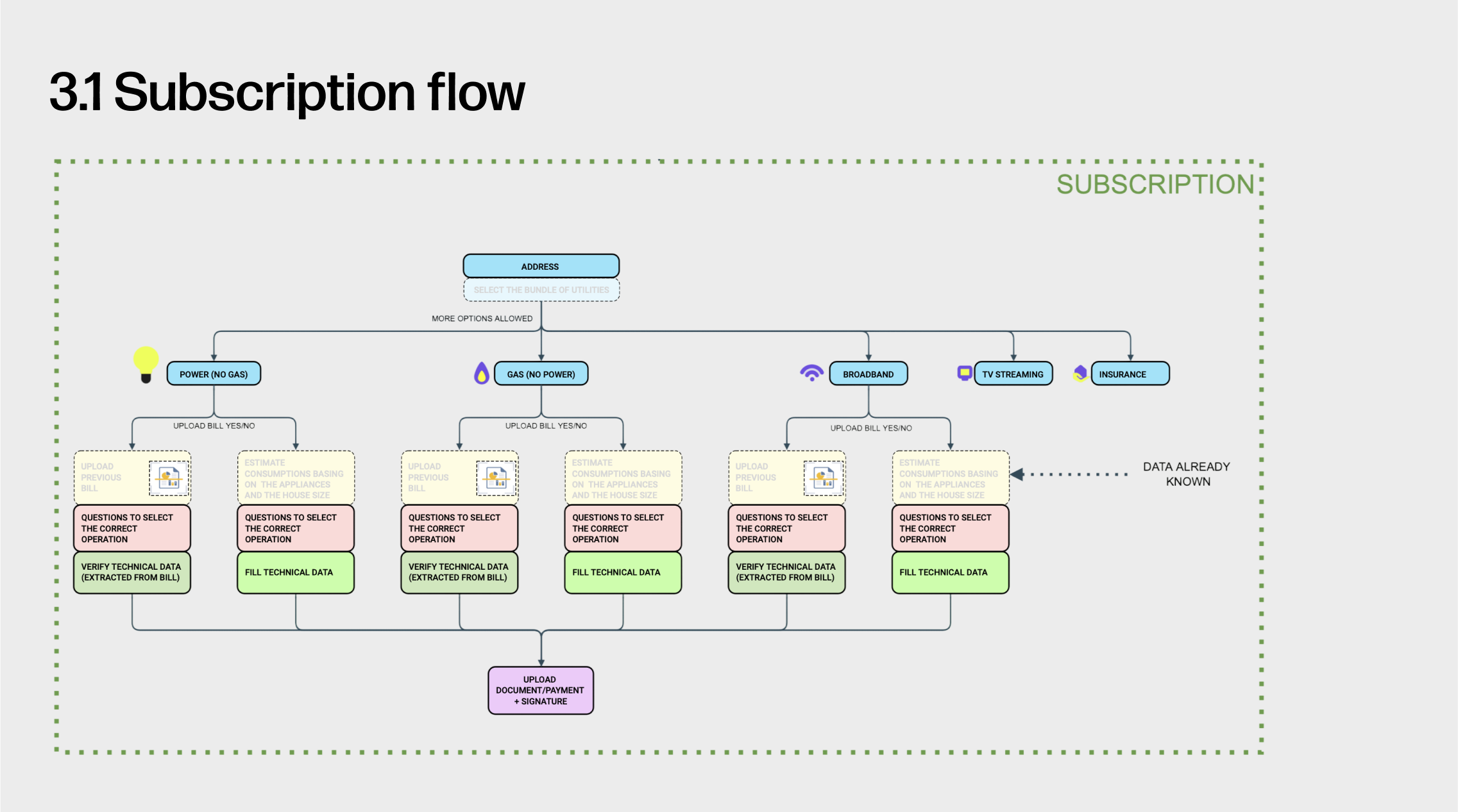
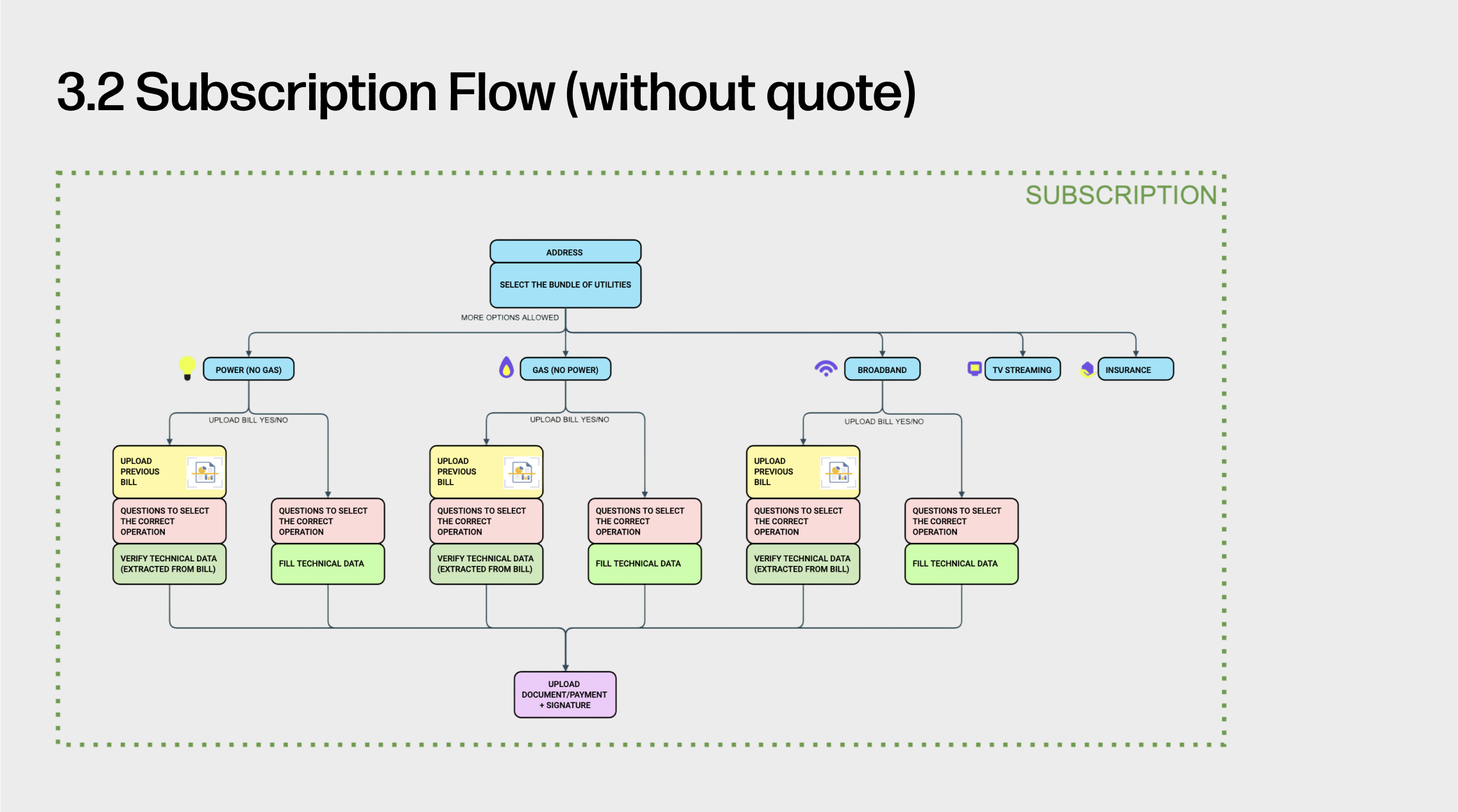
01. System Flow & Epics
I joined the project mid-way and initially collaborated with the Operations Manager to clarify the end-to-end service flow across registration, onboarding, and subscription. This process helped me quickly build a deep understanding of the overall user-system interaction.
These flows later served as the foundation for my design of the subscription section, ensuring UX consistency and alignment with earlier phases.
👉 Swipe to view the four core user flows.
2. User Stories & Design Decision
To ensure the user experience closely aligns with real user needs, I prioritized the highest-impact user stories from each epic to inform interaction design and prototyping.
👉 Contact for the full list of user stories.
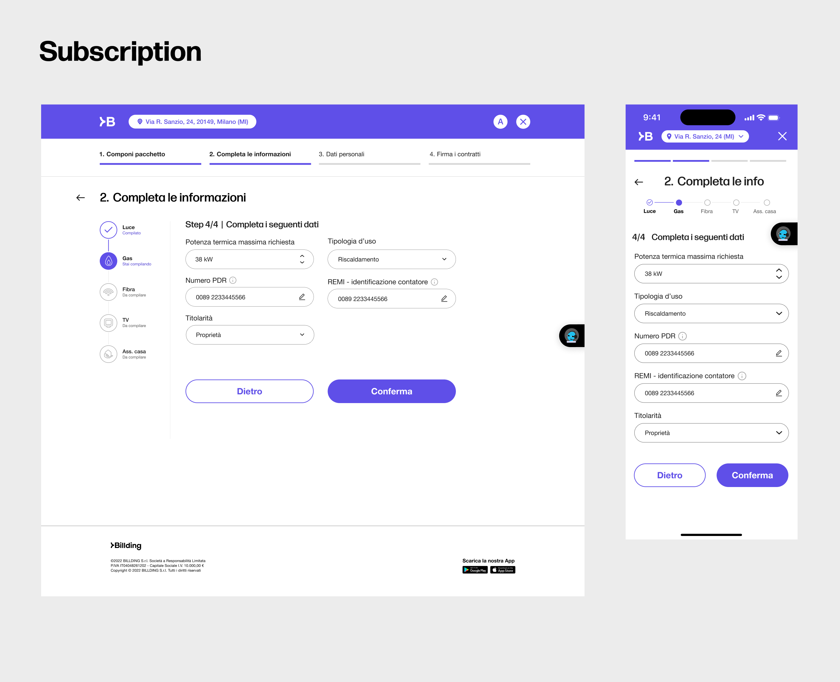
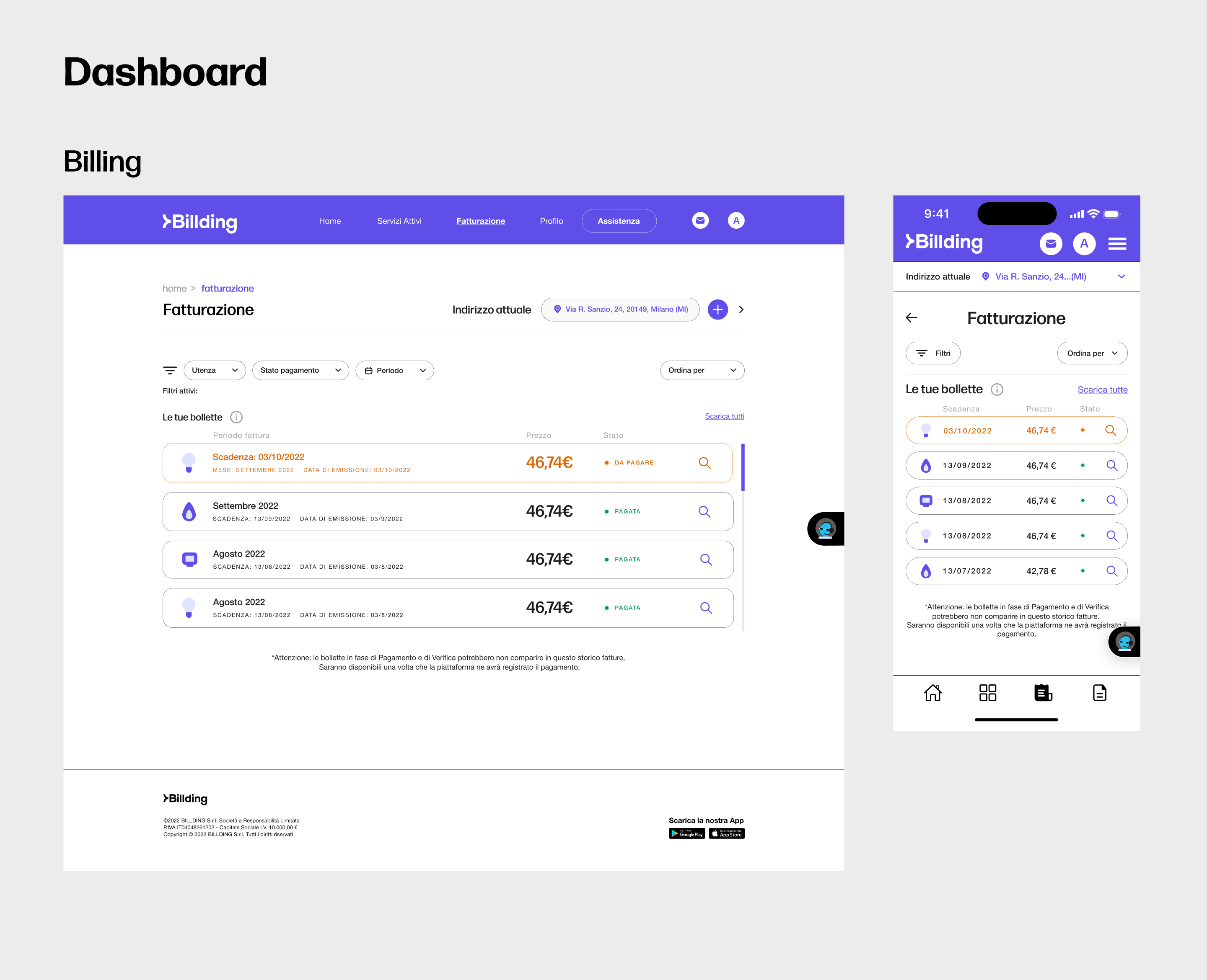
Design Decisions in the Subscription Epic
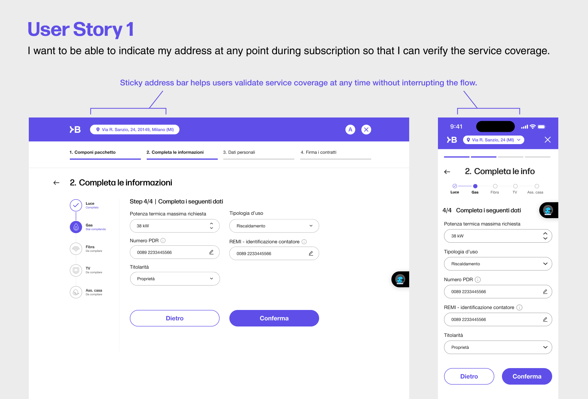
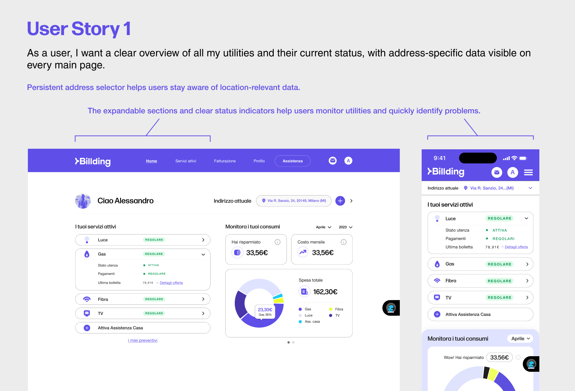
Sticky address bar – allowing users to validate service coverage at any time without disrupting their flow.
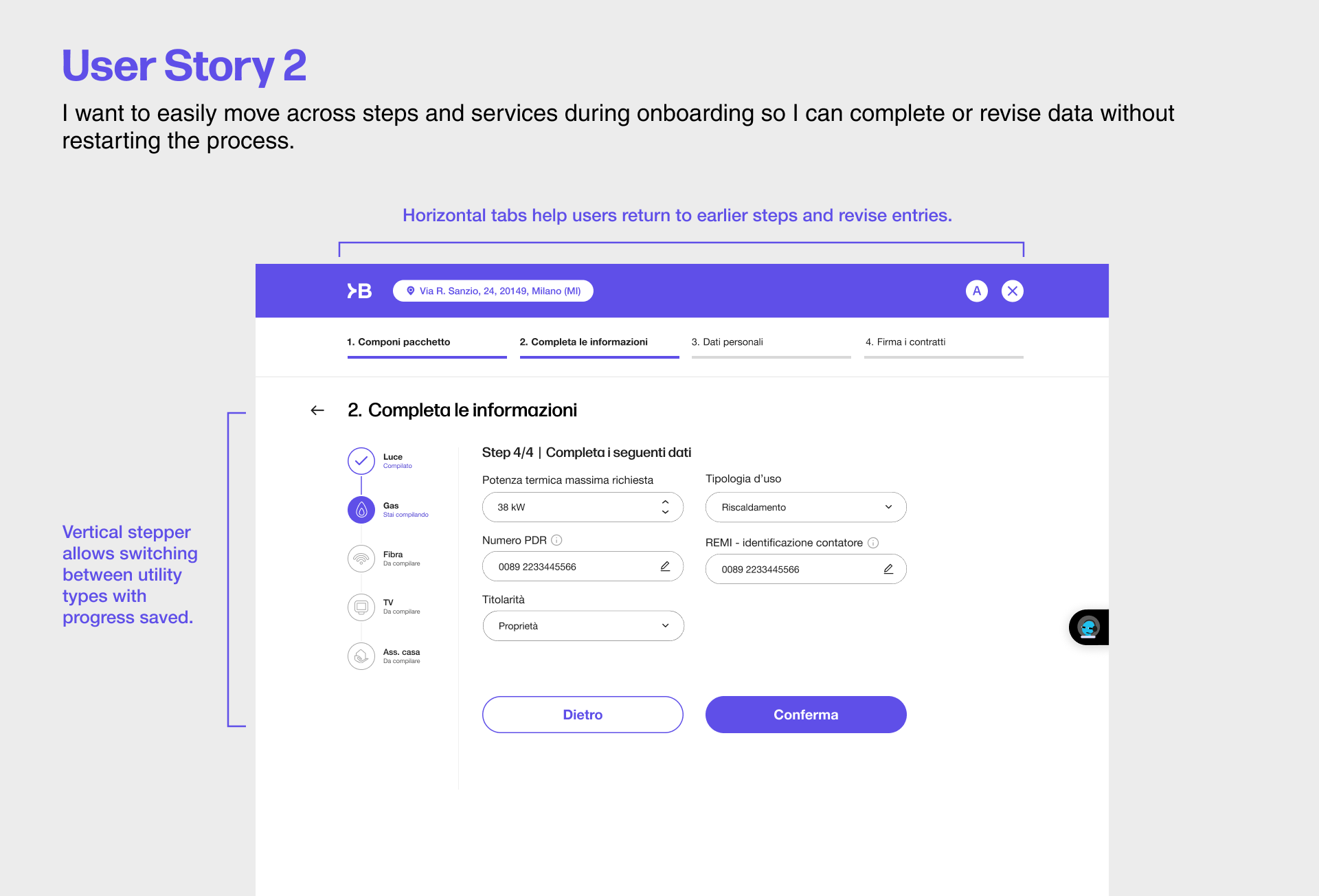
Dual-axis navigation – combining horizontal step tracking and vertical utility switching to give users full control and flexibility during onboarding.
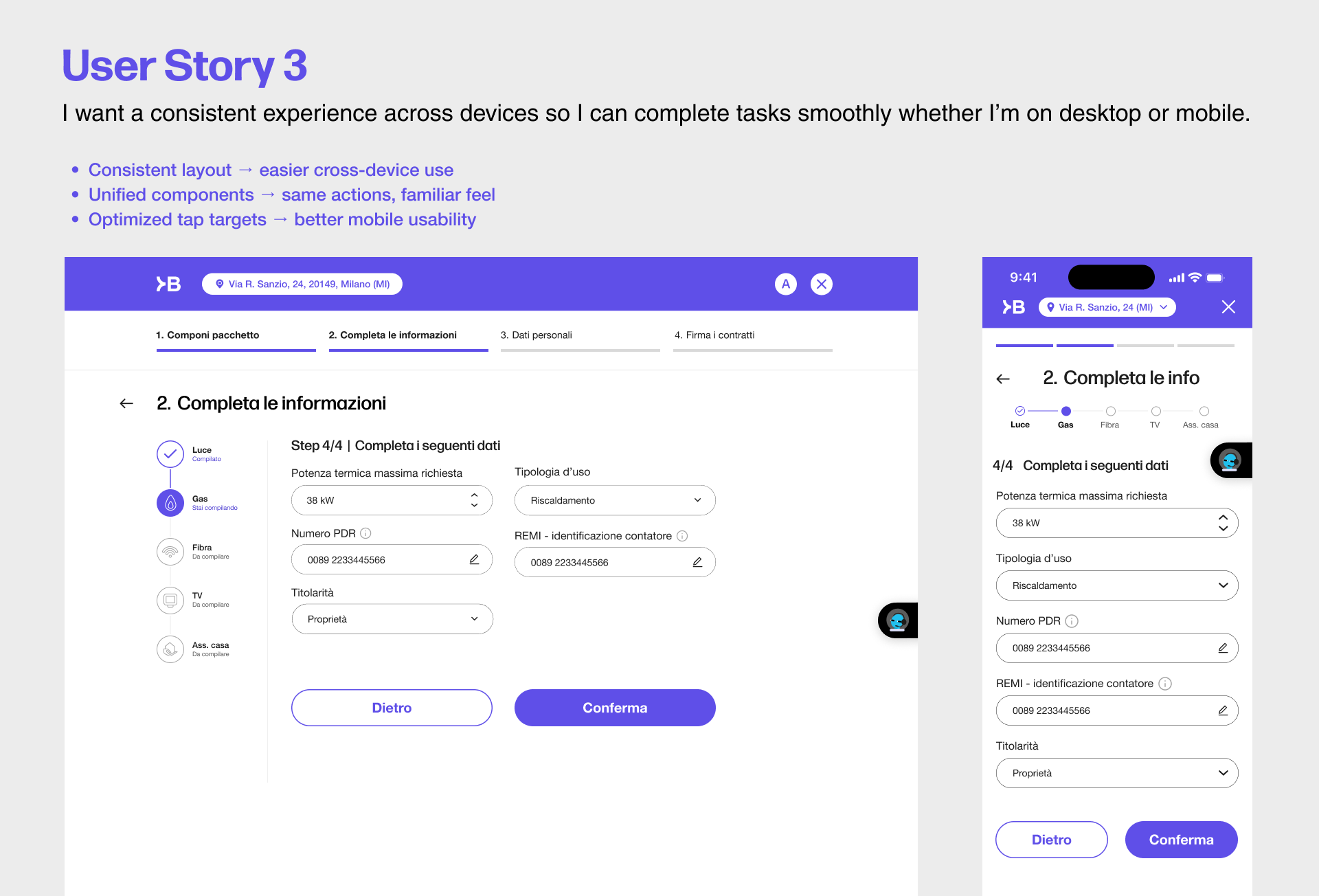
Cross-device consistency – mirroring layouts and interaction patterns across desktop and mobile to support a smooth and familiar experience on all devices.
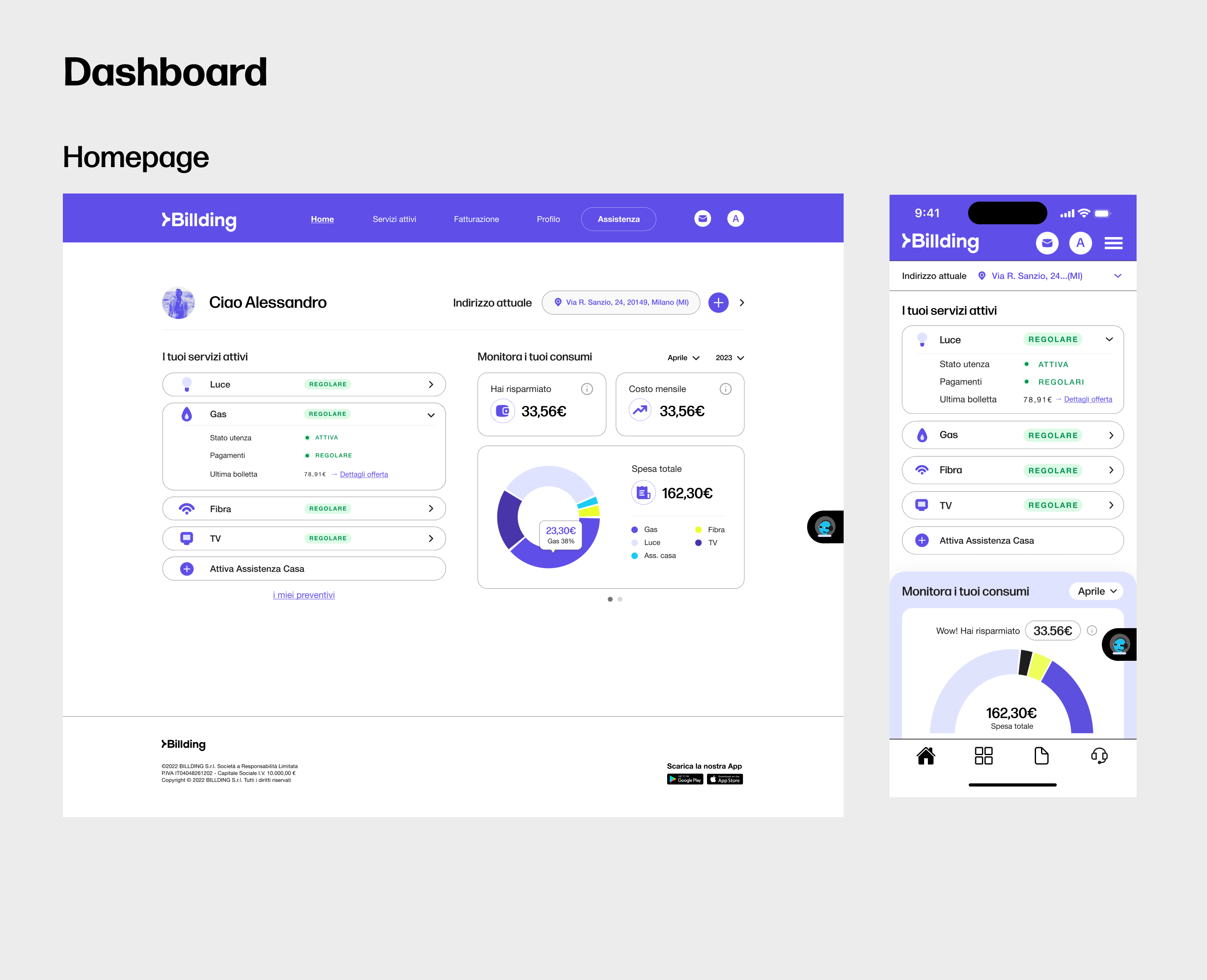
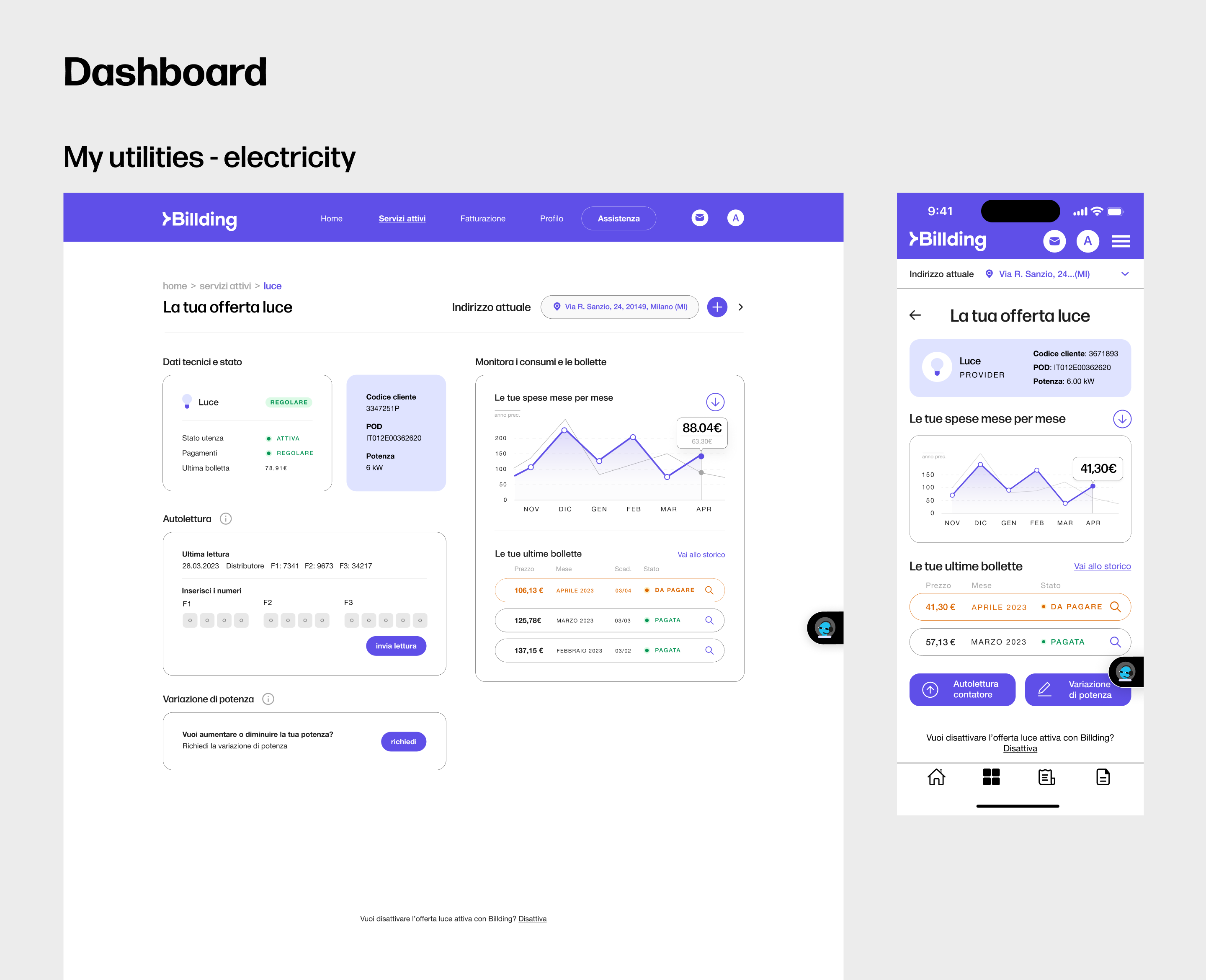
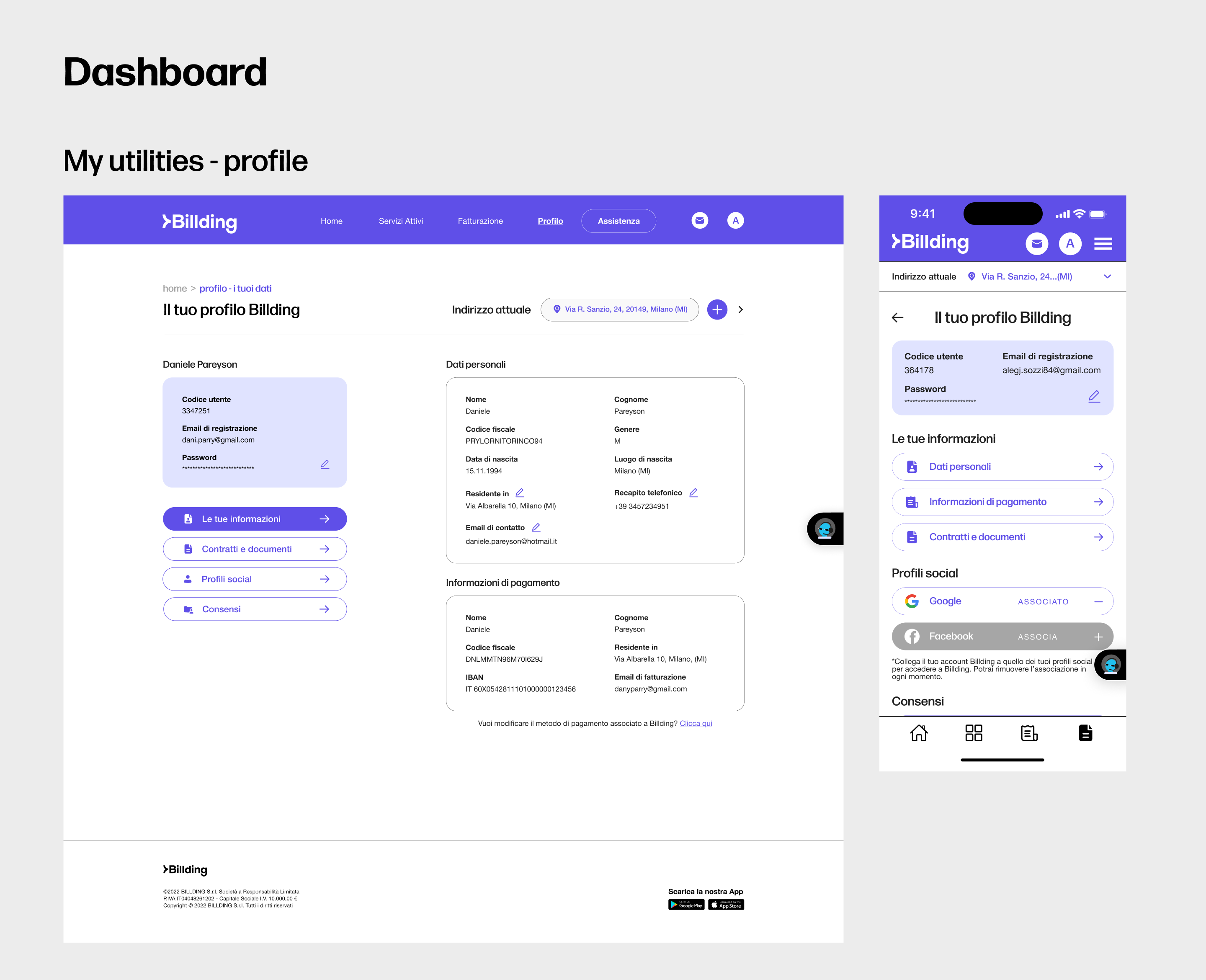
Design Decisions in Epics for Dashboard
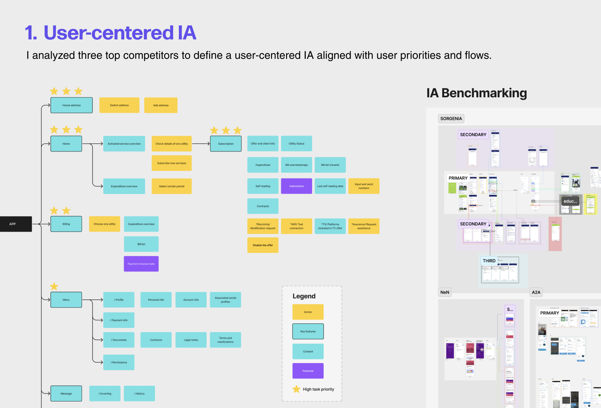
User-centered IA – Structured information based on user needs and competitor research to surface key services first.
Utility overview & issue tracking – Used expandable cards and status indicators to help users quickly spot service issues.
Sticky address selector – Integrated a consistent address dropdown across key screens, allowing users to easily verify service info tied to their location.
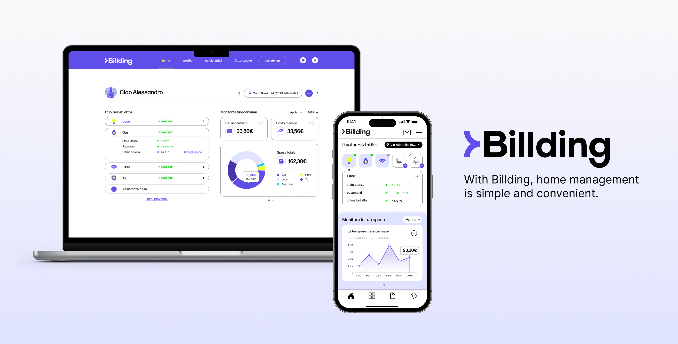
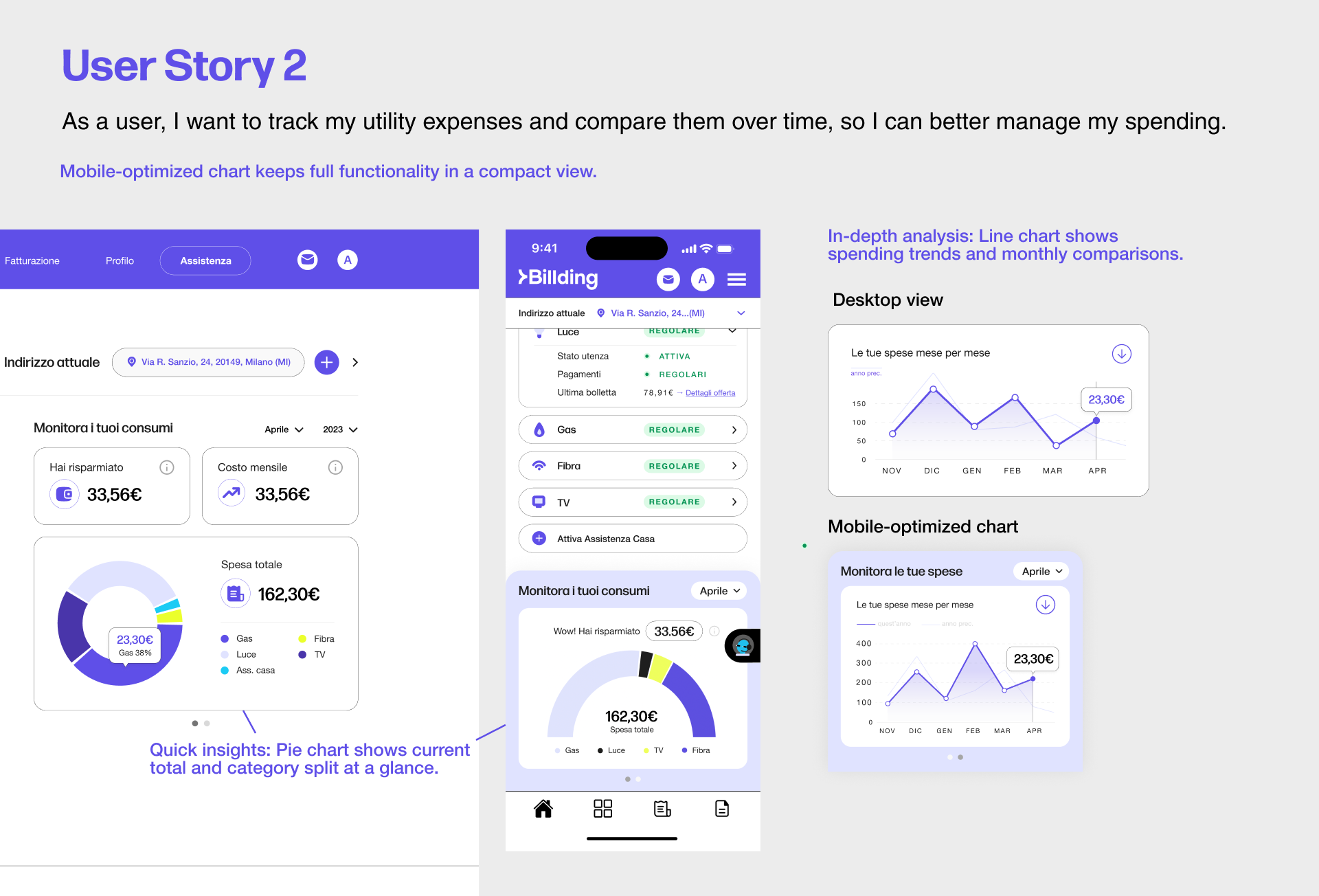
- Spend tracking with flexible filters – Designed interactive pie and line charts to support flexible tracking across time and categories.
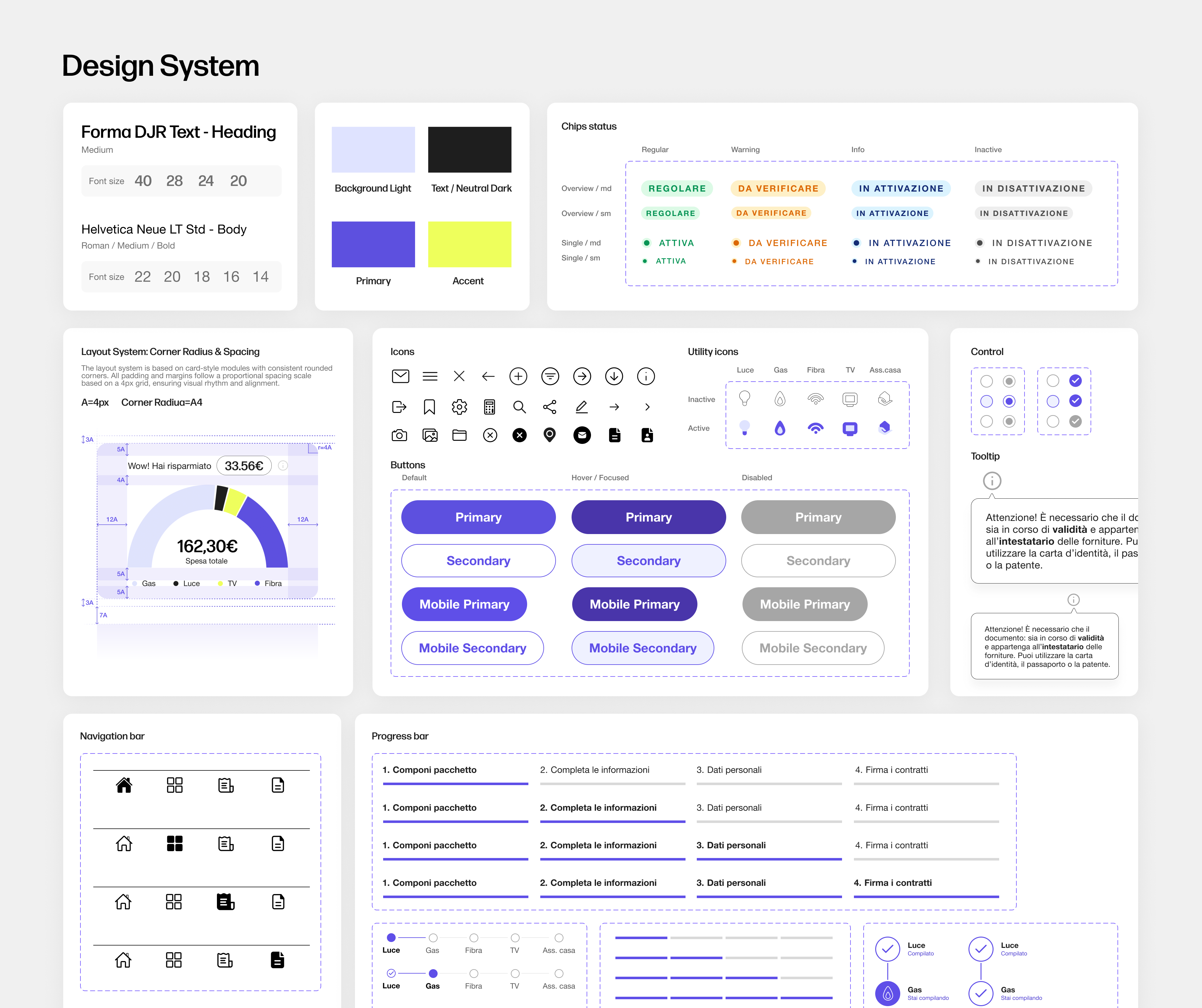
3.Design System & Delivery
After joining the team mid-way, I identified multiple inconsistencies in the existing UI components during the handover process. To ensure a unified experience and streamline future development, I proposed building a shared design system.
I created the system from scratch, defining standard colors, icons, component states, and a 4px spacing rule to support a scalable and cohesive design foundation.
With this system in place, we were able to efficiently deliver the MVP design and ensure a smoother handoff and collaboration with developers.